
Tampa Bay Buccaneers
Project Goal
My project goal was to create 3 jumbotron animations for Tampa Bay Buccaneers football games.
I chose to animate “GO BUCS” (call to action), a countdown, and a logo reveal.
Research
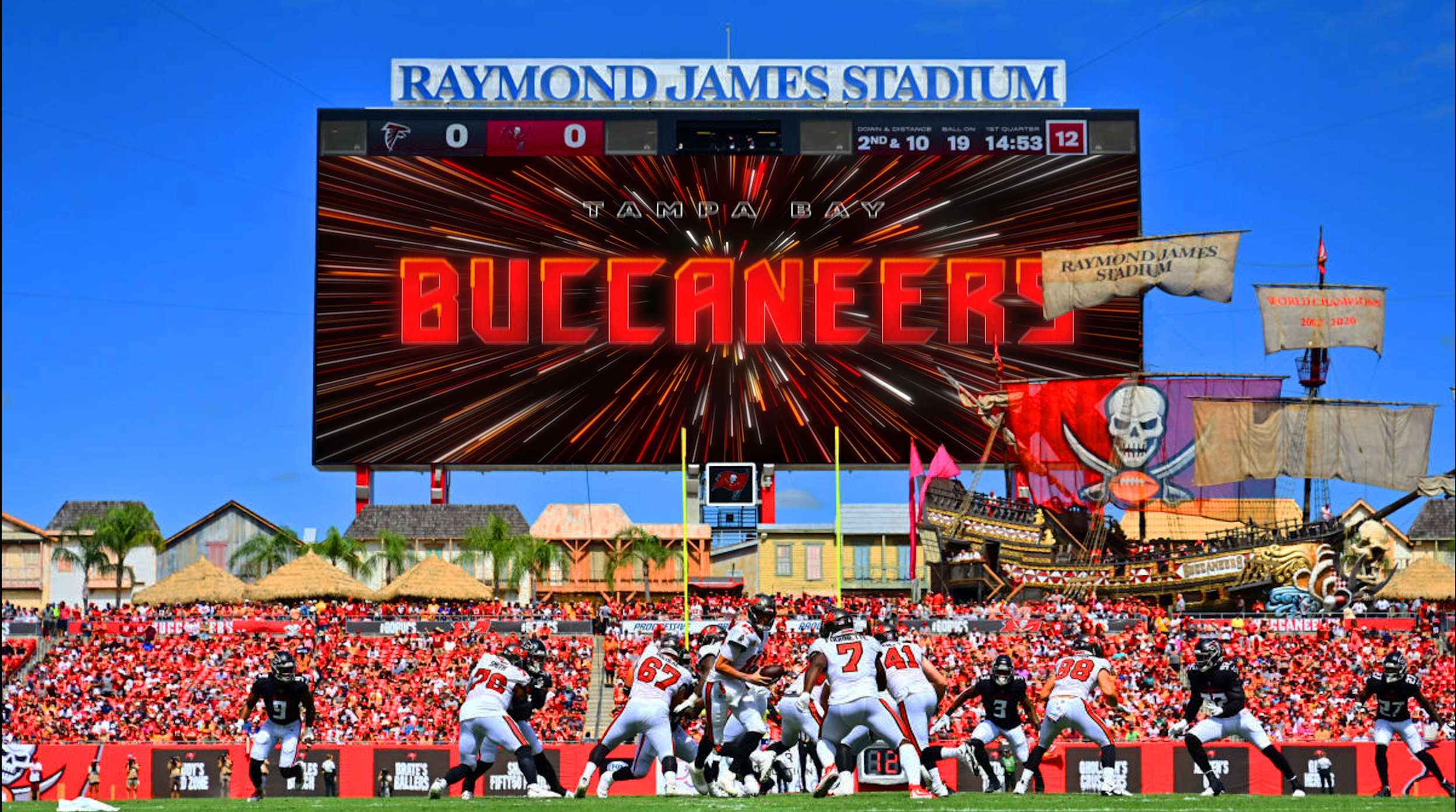
The Tampa Bay Buccaneers are a professional American Football team based in Tampa, Florida.
The Buccaneers compete in the National Football League(NFL) as a member club of the league's National Football Conference (NFC) South division.
The club joined the NFL in 1976 as an expansion team.


Initial Concepts
After having a conversation with my art director, we decided to go forward with II. Show Your Neon Energy, which has more impact, but we felt that the “plant” graphics were not strong enough. They were appropriate for Florida, but they were not football-related, and not showing “energy” or “aggression”.
Idea Sketches

As we can see from their old jumbotron animations, they prefer their design and animations to give the audience a bold, aggressive, and energetic feeling.

I. A Football Journey

Color Palette
Whenever I go to watch sports games, there is one more thing I focus on other than the game. It might sound like a motion design nerd, but I normally look at the jumbotron and think about how their design and animation could be more intriguing.
I believed it would be a great opportunity to work on a project for the Tampa Bay Buccaneers and engage the audience more in the games.
II. Show Your Neon Energy


Therefore, I decided to switch out the older leaf patterns, and tried to incorporate more icons that are related to football.


After working with my art director, for the next pass, I decided to bring the "flag" back to the logo at the end.
The new “football-related” assets weren’t very interesting, so I had to find “Bucs-related” assets in more interesting ways.
And the art director suggested me to have more dynamic movement(anticipation, exaggeration, etc.) for the assets and logo rather than having them just flickering so that it could give a more aggressive and energetic feeling.
Also, he shared his ideas to achieve the aggressive and energetic feeling: having faster, more z-axis and jiggly animations.
Working with the art director, we recognized that the animations got nicer and smoother, but they didn’t have the “impact” that the Buccaneers deserve.
So we talked about our emotional keywords for this project. And I came up with these keywords that I felt were critical and defining the success of my animations.
: BOLD, AGGRESSIVE, DRAMATIC, HAMMERING

When it comes to neon lights, we normally think of vibrant colors including pink, blue, or green.
But since I had to follow the colors that the Buccaneers already have(red, orange, black, white, and pewter), my neon design became more bold and aggressive.
1st Pass
Revisions
2nd Pass
Tampa Bay Buccaneers has very strong taste when it comes to their brand design and animations.
This direction was inspired by “buccaneers” who explored the oceans.
A football is having its own journey around the 3D logo and text.
The ball represents the players and the audience who are enjoying
the football game at the same time.
This direction is focused on the concept of “energy” and the audience.
One of the previous ideas I proposed for showing the energy was using “neon” lights.
Final Animations
Animation Mockups
The club is owned by the Glazer family and plays its home games at Raymond James Stadium in Tampa.
The Buccaneers have won two Super Bowl championships in 2002 and 2020.